GROCERY
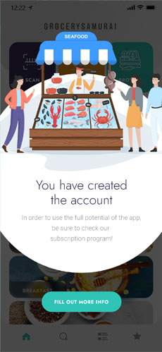
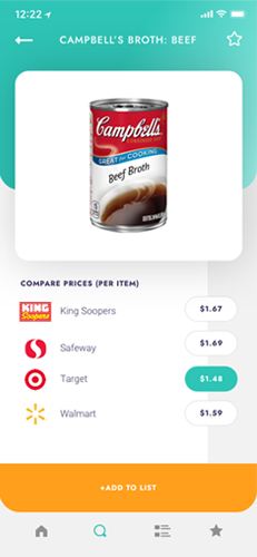
GROCERY SAMURAI
Simplest form of shopping
is here.
expertise
USER EXPERIENCE
USER INTERFACE
DELIVERABLES
IOS APP DESIGN
MARKETING MATERIALS
Discovering
the chalenge
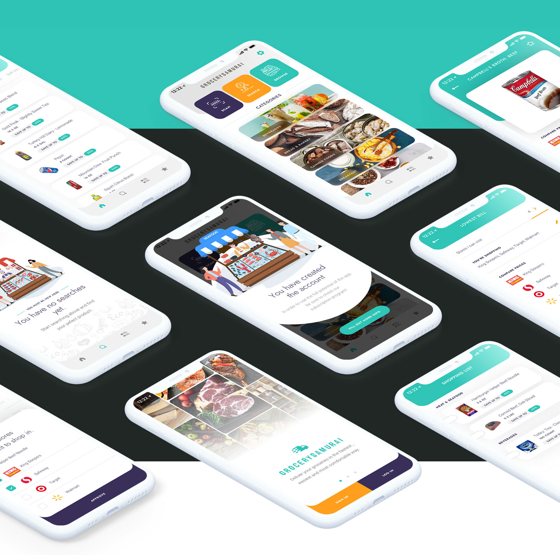
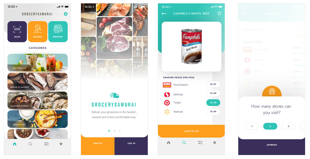
Grocery Samurai helps people to do their grocery shopping as fast, effective, and most importantly - as cheap as it gets. They approached me at the beginning of their journey, asking me to help with both UX and UI of the application. I analyzed e-commerce and grocery-related applications, and asked myself, how to make things easier?
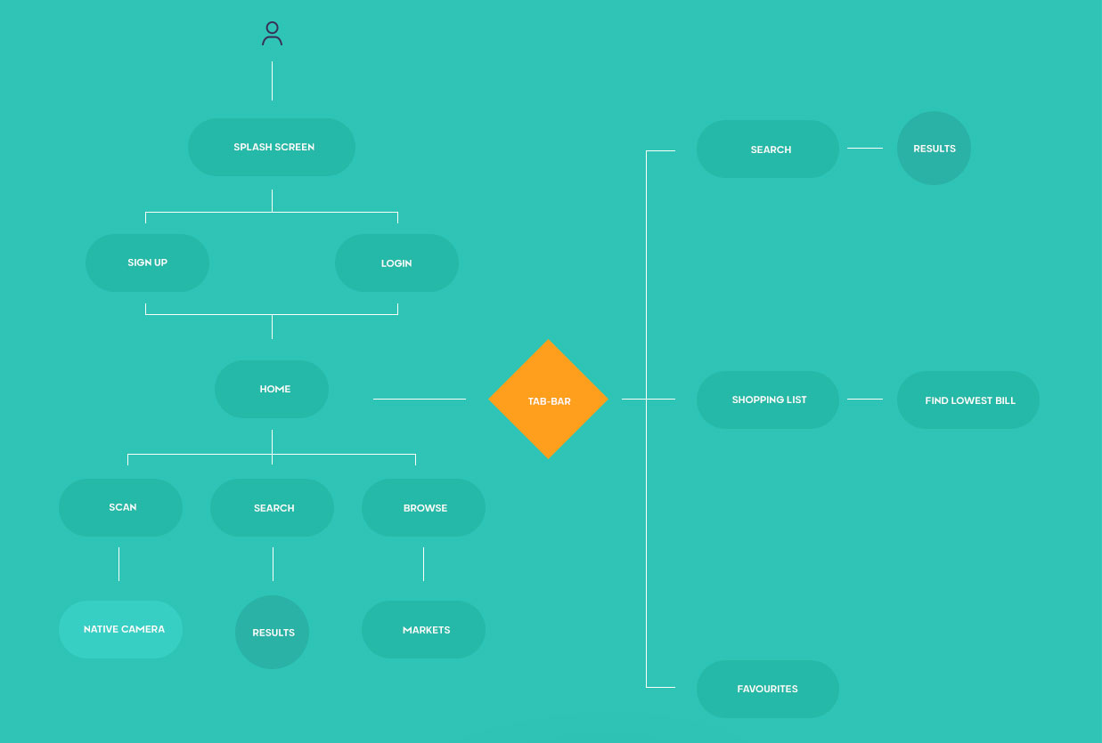
Information Architecture
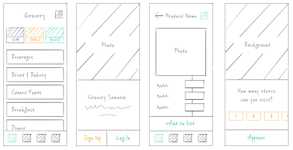
Since the market of e-commerce and grocery optimization was already full of competition, in the while choosing the goals, competition analysis was important.
We decided, to find a balance between making the flow simple and features powerful enough. This balance would allow for Grocery Samurai to stand out in the market, and become the most comfortable go-to for the users.
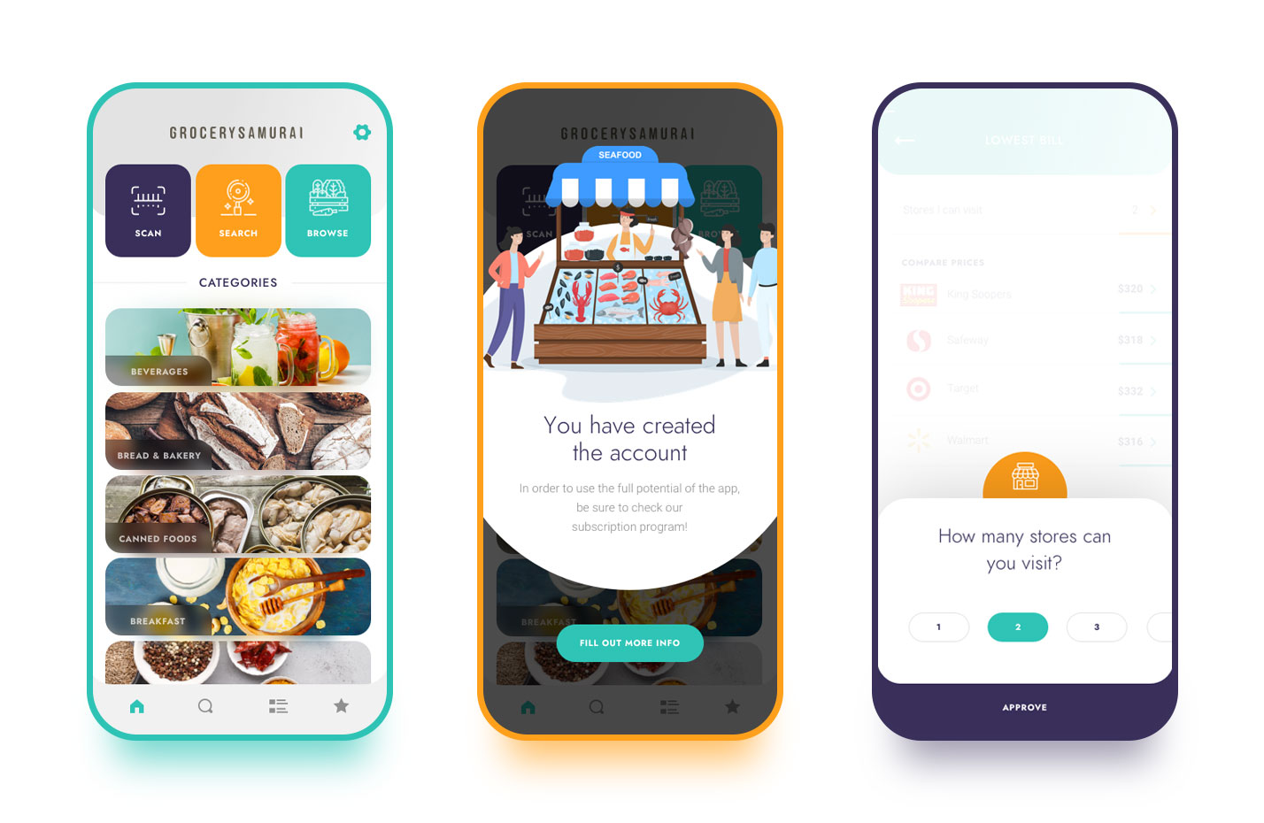
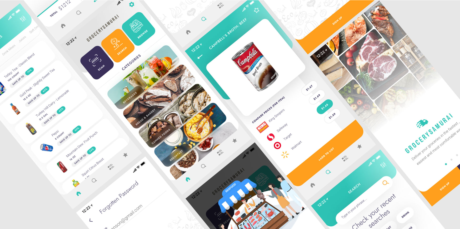
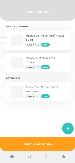
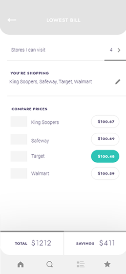
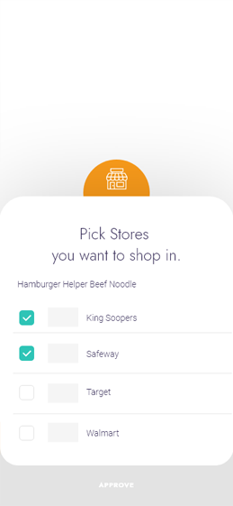
Optimizing bills of our users was the key, to bringing value. This is why Grocery Samurai had to have few features, that would allow that to happen. The main one, would allow a user to make a list of groceries, and pick the mall which would be the cheapest
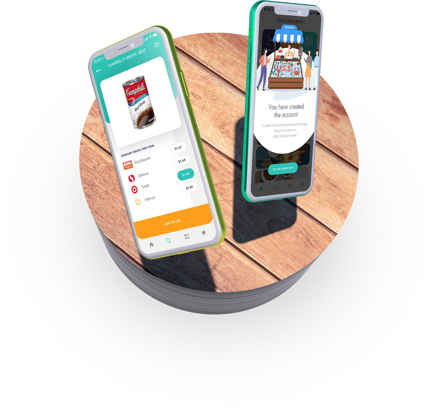
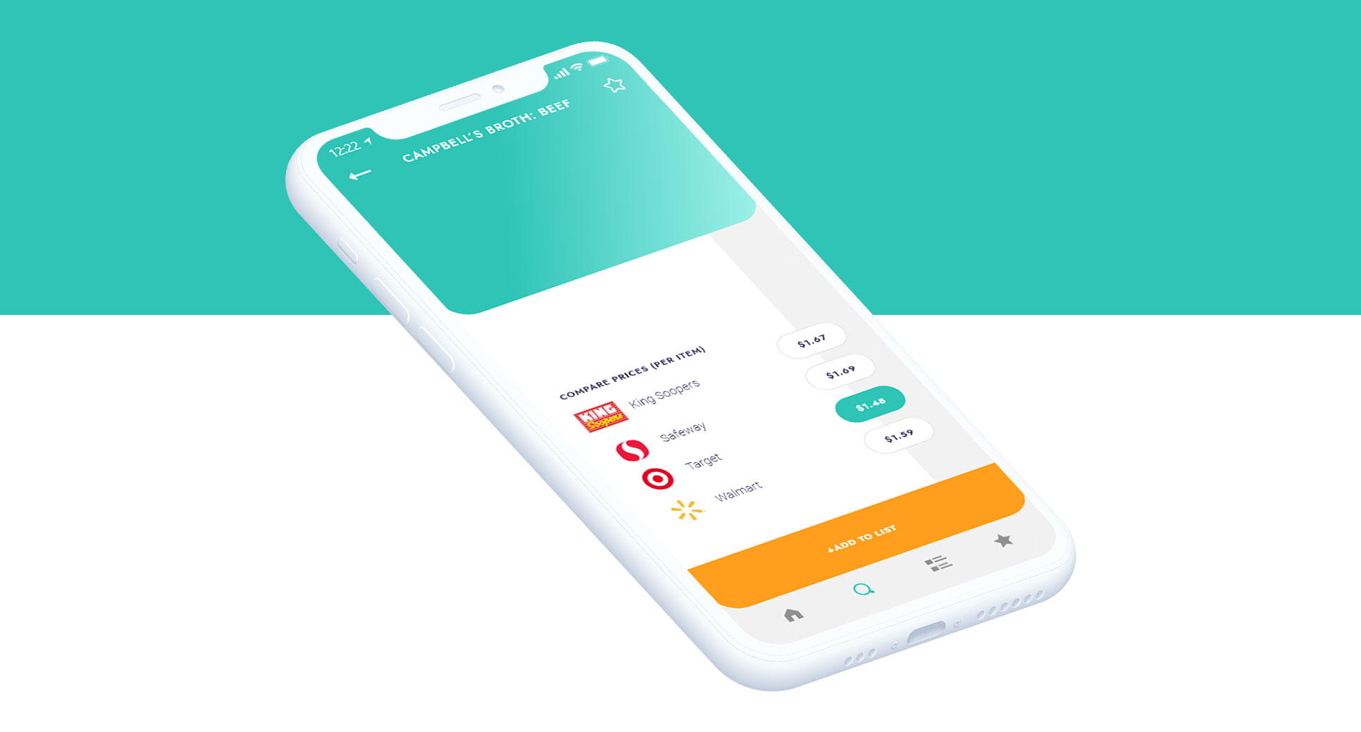
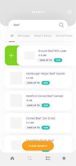
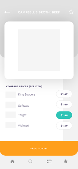
The second option would allow the user to go another way around, and san the product to compare the prices in different markets.
Define
After understanding the flow, and having the idea, what are the core features, that we want to build we asked ourselves some more questions. Our goals were to understand the challenges customers from markets face during shopping to build enough tools, to respond to their needs.
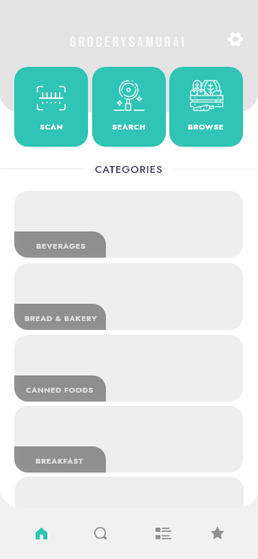
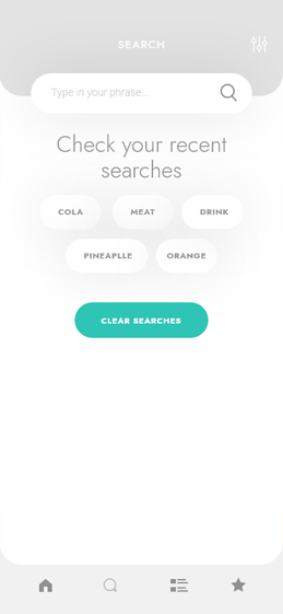
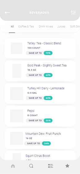
Building wireframes, around the core two features, we were thinking about how to enhance them, and make them even more useful.
This leads us to build the whole catalog of products, from 4 most popular markets in US and comparing the prices. it would allow the user, to decide what products are most important, and see the comparison.
We also have decided, that the application can have some additional use-cases, from the main one. We added the feature of favorites, which potentially could encourage users to use the application more often.
Visual Language
Having modern and engaging visuals was important for the strategy of the app experience, and marketing.
We went for really bright and fresh colors, that would attract the attention, and envoke the associations of fresh fruits or vegetables.
We went for really bright and fresh colors, that would attract the attention, and envoke the associations of fresh fruits or vegetables.
TIFFANY BLUE
#2EC3B5
#2EC3B5
ORANGE PEEL
#FFA01C
#FFA01C
WHITE
#FFFFFF
#FFFFFF
SPACE CADET
#3A305B
#3A305B
DARK PURPLE
#2E283F
#2E283F
Solution
Application created was in stage of MVP, and ready for some adjustments from users , without bigger changes of the hypothesis.
Core features of application were solid, and brought value to their users.
Core features of application were solid, and brought value to their users.
