KNALLER
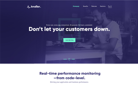
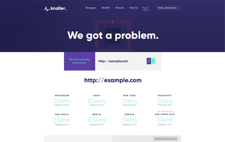
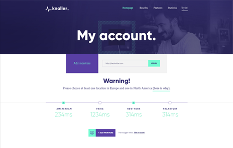
KNALLER TECH
Always know the status
of your server.
expertise
BRANDING
USER EXPERIENCE
USER INTERFACE
DELIVERABLES
BRANDBOOK
LANDING PAGE
WEB APP
Discovering
the chalenge
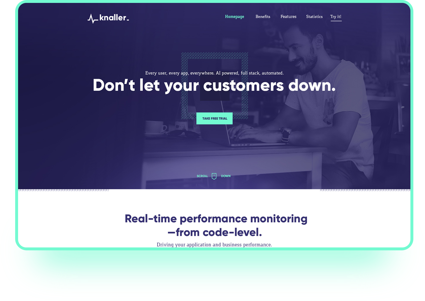
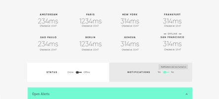
Knaller Technologies is a startup that wanted to disrupt the market of IT SaaS technology. They reached me at the beginning of their journey, and the goal of the project was to create a reliable and easy to use app that helps to determine the status of your server in different places around the world.
During the discovery stages, I asked myself - how can we make this service better and more transparent?
During the discovery stages, I asked myself - how can we make this service better and more transparent?


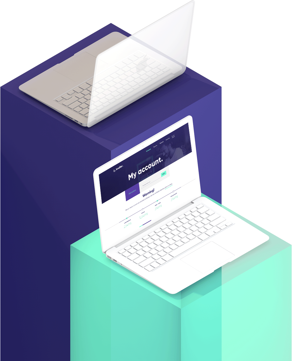
Information Architecture
Me and the clients' team analyzed the requirements and most important use cases, organizing the features in sections, and defining user stories.
One of the biggest challenges was to find a way to make the experience stand out from the competition - which required understanding target group - front-end and back-end developers.
One of the biggest challenges was to find a way to make the experience stand out from the competition - which required understanding target group - front-end and back-end developers.
In order to be sure, that the process is clear, we have used a few exercises, that aimed at making the process as smooth as it is possible.
We started with affinity mapping - which helped us to analyze the users and the competition, finding the gaps, which we could use for a better experience
We started with affinity mapping - which helped us to analyze the users and the competition, finding the gaps, which we could use for a better experience
Analysis of the data and observing competition lead to the creation of personas - step of personas gathering was crucial for understanding the needs and goals.
After gathering all info, some of the challenges became more clear.
The first one was to allow the user to get feedback on the server in the most straightforward way. Second, was to decrease the number of features, to just essentials - which allowed us to put emphasis on the most important parts for the target group.
The first one was to allow the user to get feedback on the server in the most straightforward way. Second, was to decrease the number of features, to just essentials - which allowed us to put emphasis on the most important parts for the target group.
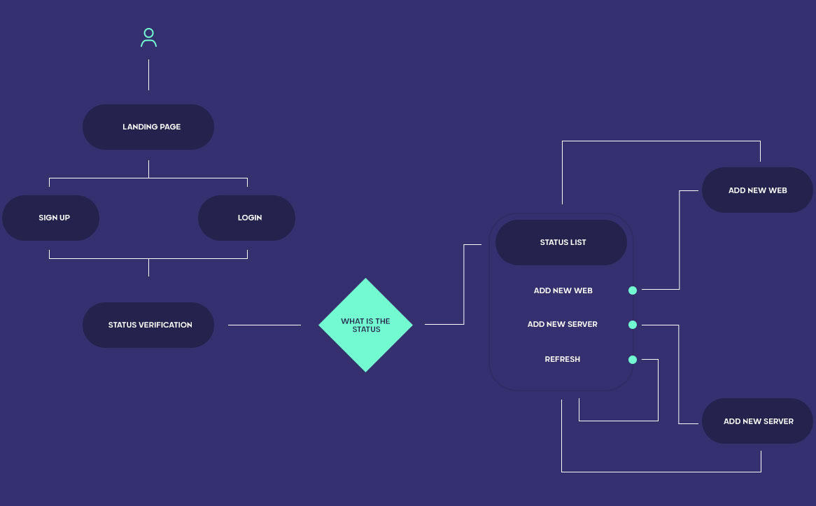
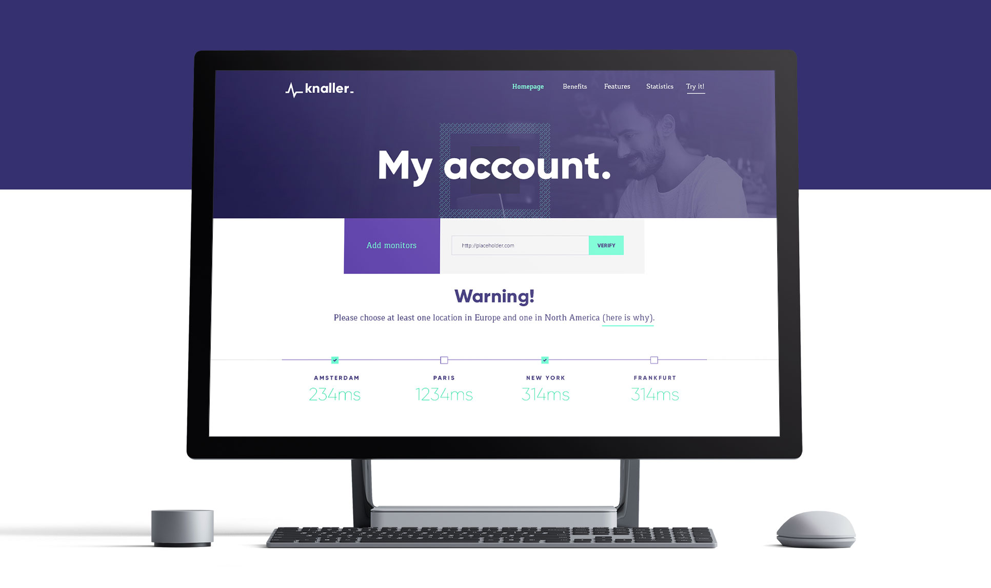


Define
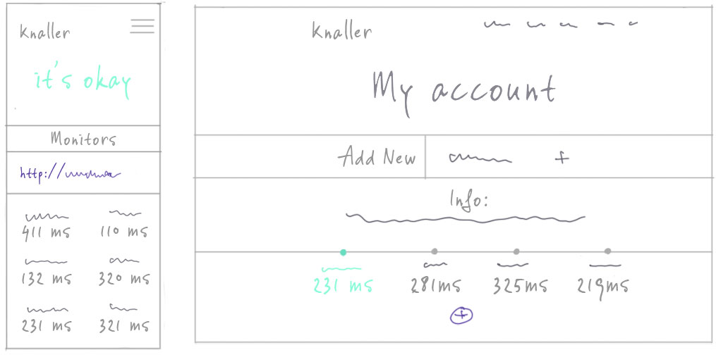
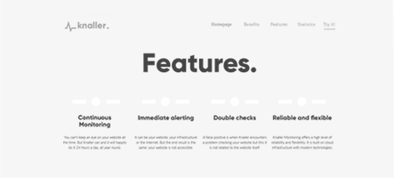
When both user stories and user flow were finished, I moved to wireframe creation. the main goal of wireframes is to have a clear understanding of ideas and be sure, everyone in the project understands the direction we're heading in. The second really important purpose is the ability to make initial A/B tests, that would shed some light on users' expectations.
While collaborating with the startup team, I was making sure, we always are focusing on the goals, and every design decision is justified by them.
In some of the cases, during the in-house brainstorm after seeing the wireframes, we have found some additional problems to solve - We were always focusing on finding the right solutions in bounds of most important goals defined in the previous step.
A/B testing for the wireframes was he final part of this step - some of the potential users tested the clickable prototype, and we were analyzing there response, behavior during the usage, and feedback. It helped us to make necessary adjustments before moving to the visual design part.

Visual Language
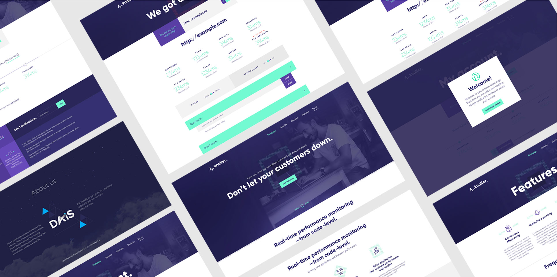
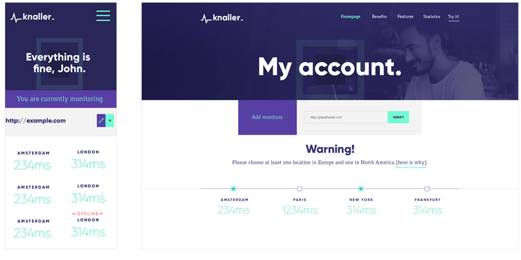
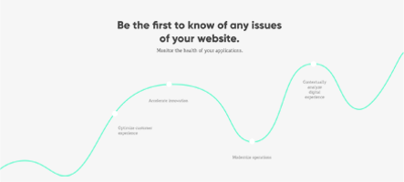
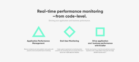
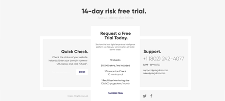
Visual language for this project, was aiming to be really in trends, but at the same time, it should be familiar to the developer's community - So, we have decided, that purple with aquamarine would be a perfect choice since it's well known on markets.
DEEP KOAMARU
#35306F
#35306F
BLUE-MAGENTA VIOLET
#5C4398
#5C4398
WHITE
#FFFFFF
#FFFFFF
AQUAMARINE
#73FAD1
#73FAD1
ONYX
#32393A
#32393A
Solution
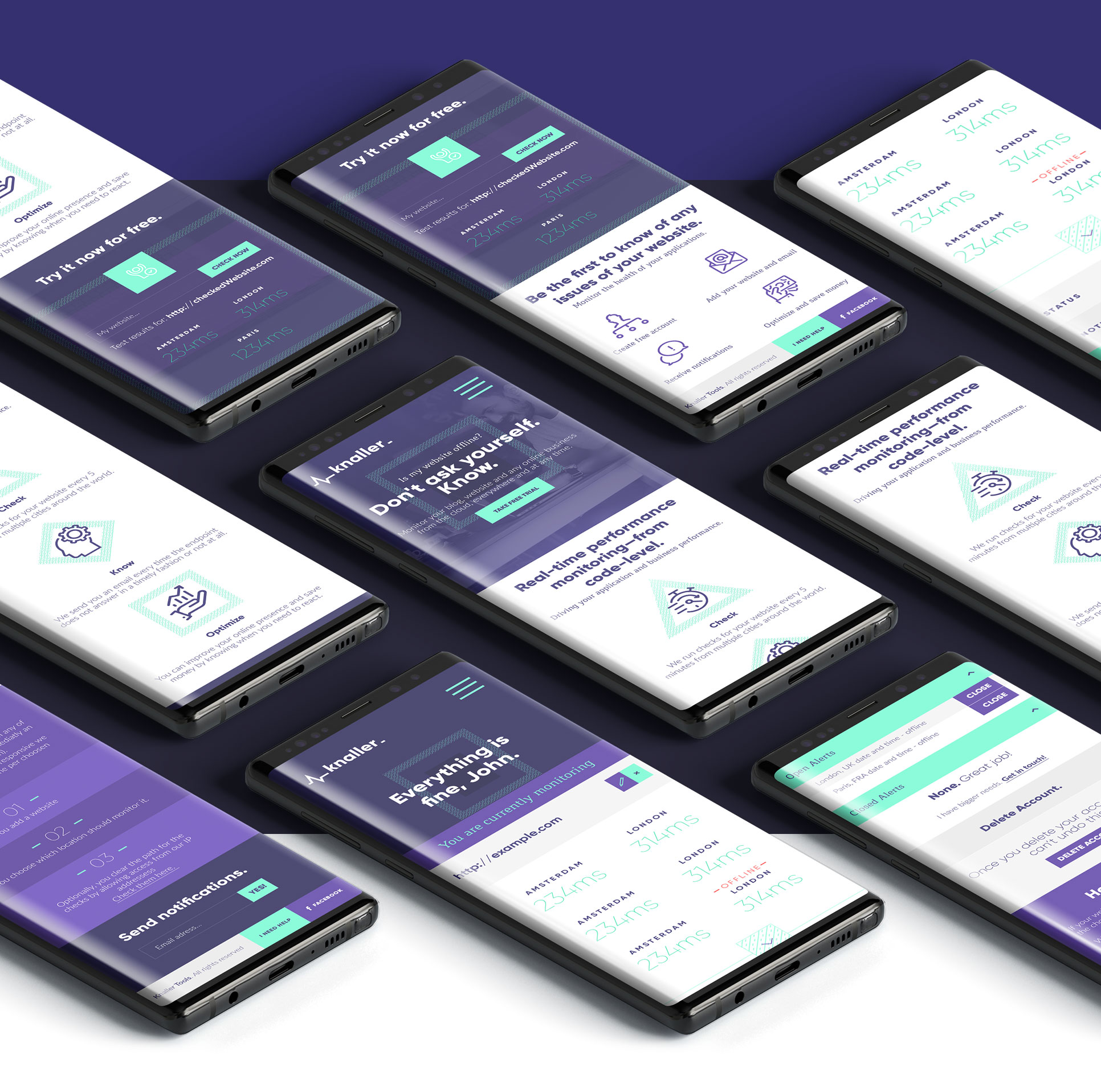
The created solution was proven to be effective for users. Application and it's services made users feel secure, and it Knaller application helped for monitoring servers on a day-to-day basis.
UI/UX services helped to gather initial funding for the project, moving it from MVP into a more developed software stage.
UI/UX services helped to gather initial funding for the project, moving it from MVP into a more developed software stage.
