SOLIPOINTS
SOLIPOINTS
Saving the world can be
easier than you think.
expertise
USER EXPERIENCE
USER INTERFACE
DELIVERABLES
IOS APP DESIGN
MARKETING MATERIALS
Discovering
the chalenge
SoliPoints is the reward app that saves the planet while saving money for their
users. They came to me, after the initial release of the application, and I was working with their team to improve UX and implement new features. But there was also a bigger picture - we wanted to capture what it means for the app to be as transparent as possible - since SoliPoints in it's business model, should be a part of every-day life.
users. They came to me, after the initial release of the application, and I was working with their team to improve UX and implement new features. But there was also a bigger picture - we wanted to capture what it means for the app to be as transparent as possible - since SoliPoints in it's business model, should be a part of every-day life.



Information Architecture
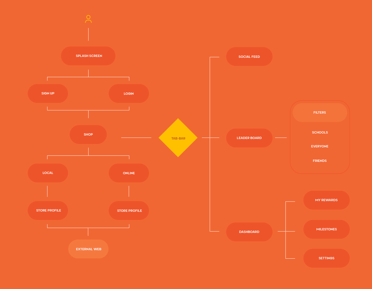
At the beginning of the project, I needed to analyze the user-flow that was already implemented. Then, the main goal was to understand the structure of the app and be able to make small and big adjustments without breaking the flow.
Throughout the project, user-flow was changing many many times. Being sure, that UX will be optimized keeping in mind personas and our target group was really important.
But the second element while working with Soli, was to be sure app experience is in line with new challenges and goals. They were formed based on feedback from current users and testers.
But the second element while working with Soli, was to be sure app experience is in line with new challenges and goals. They were formed based on feedback from current users and testers.
The first goal was to communicate clearly what are the ecology and financial profits, and how to use them.
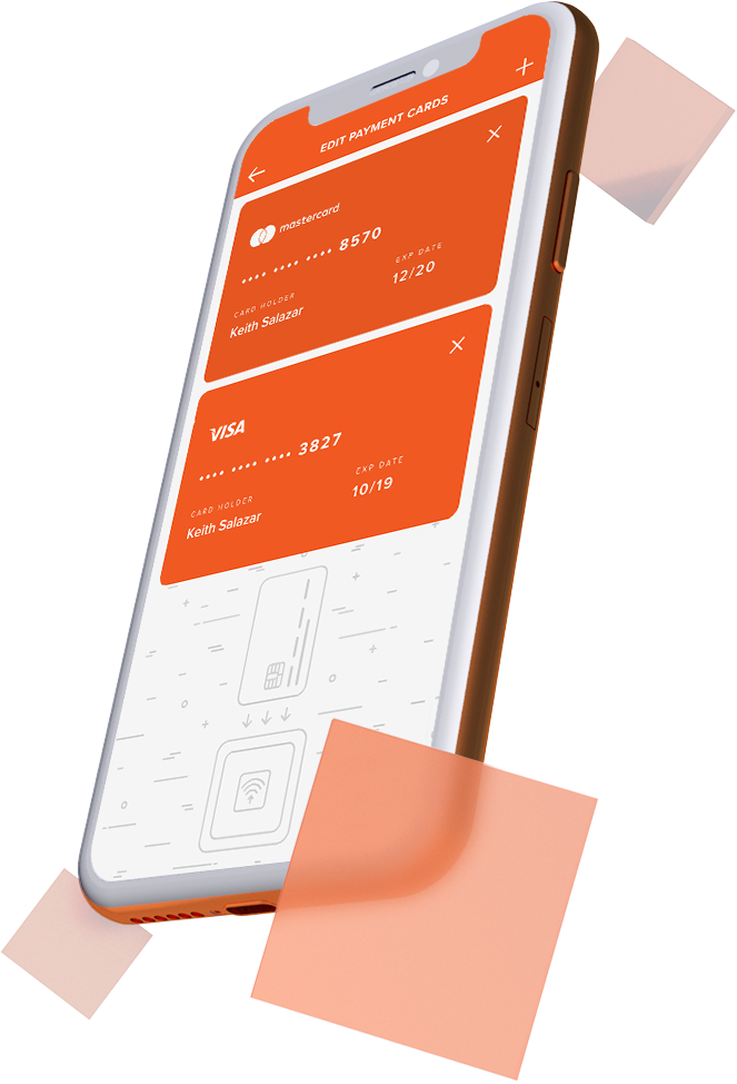
We have achieved that, while optimizing features of payments both to foundations and to personal wallet - We were trying to have an as small amount of taps as it was possible.
We have achieved that, while optimizing features of payments both to foundations and to personal wallet - We were trying to have an as small amount of taps as it was possible.
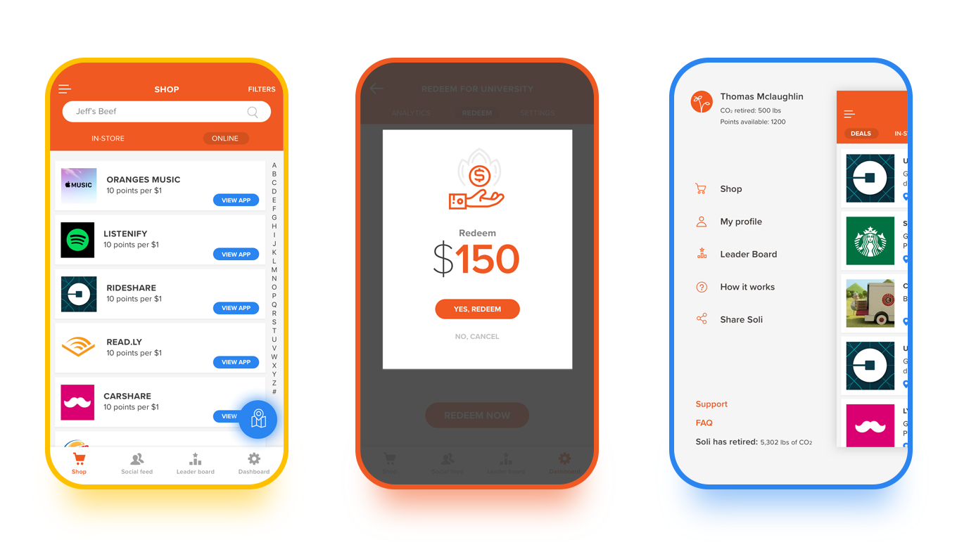
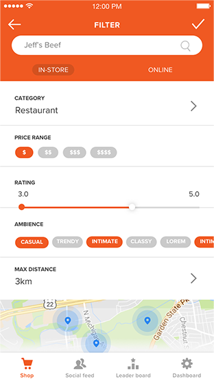
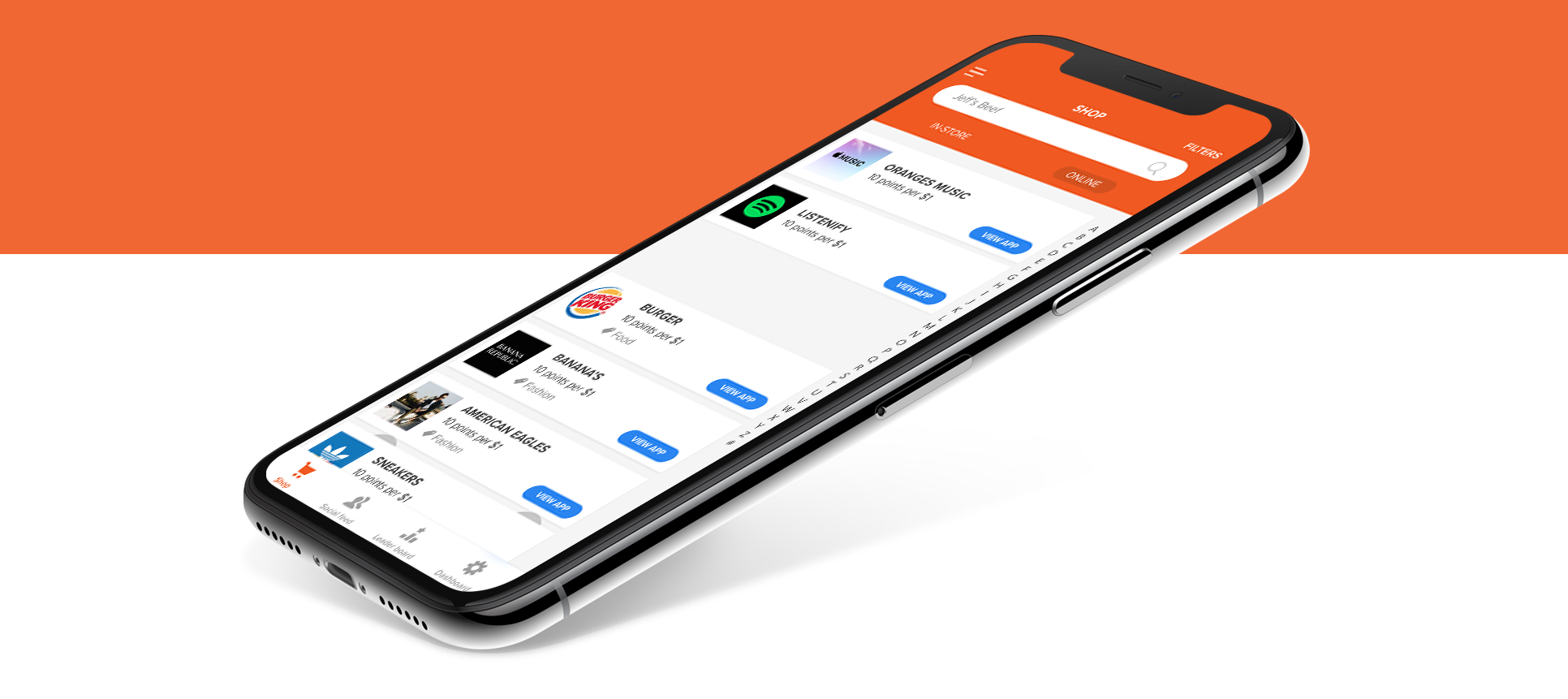
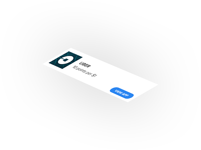
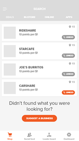
The second goal was making application an "e-commerce like" experience. Since our main goal, was to make an app part of everyday life, we needed to make looking for shops participating in the program easier and more accessible - this is why we were working hard on optimization of filters and map view switch.
Define
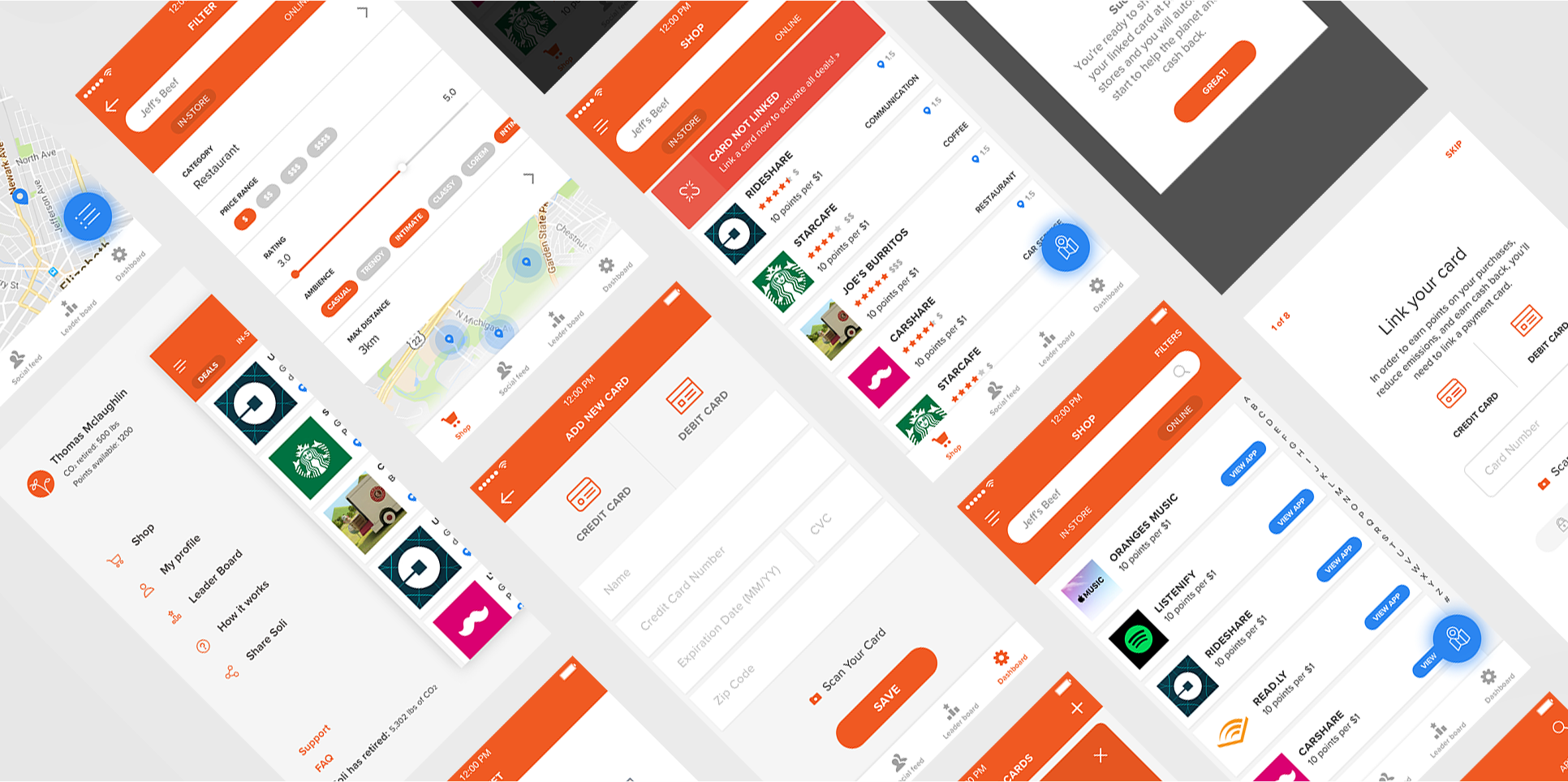
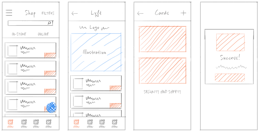
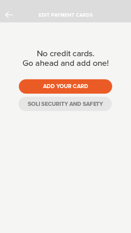
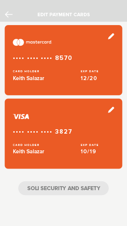
Wireframing is always the part of the process which makes things clearer and allows us to make a brainstorm for the most important steps.
Since the application will be used while moving through the city, making every-day activities, we decided to focus on making each interface simple and straight to the point.
Since the application will be used while moving through the city, making every-day activities, we decided to focus on making each interface simple and straight to the point.
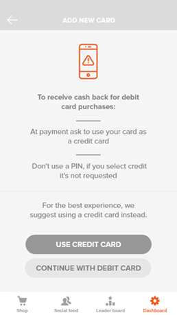
While re-building or adding the features, transparency was important - we had in mind, that app needed to be reliable, both because of working with foundations, and because of working with buy and sell transactions.
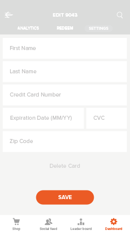
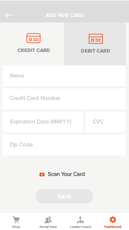
Ensuring trust had the second stage to it - Safety. To be sure, that our users will feel safe during the usage of the app, we needed to be sure, that experience is evoking the feeling of safeness. To keep users informed, we added info popups, to make what we're doing more clear.
While wireframing, we kept in mind, that we have limited capabilities of testing and data gathering. This is one of the reasons, we were using most important applications on the market as a flow basis for some of the features - because of that, we didn't need to test some of our solutions - they were already widely known by users.


Visual Language
The application already had the interface and brand colors. I was only iterating on color shades and proportions. In order for the app to be seamless, color choices needed to be consistent throughout the application. While working on marketing materials with SoliPoints team, we decided to enhance these with Fluorescent Orange, to enhance the conversion.
VIVID VERMILION
#35306F
#35306F
FLUORESCENT ORANGE
#5C4398
#5C4398
WHITE
#FFFFFF
#FFFFFF
BLEU DE
FRANCE
#73FAD1
FRANCE
#73FAD1
JET
#32393A
#32393A
Solution
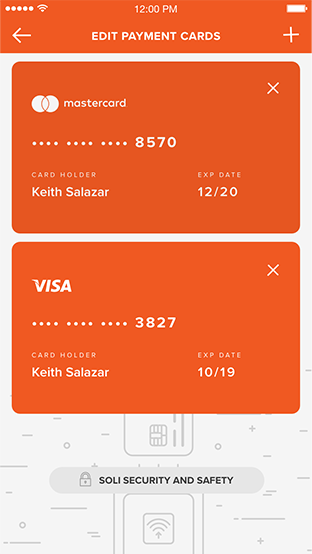
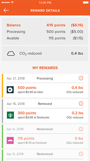
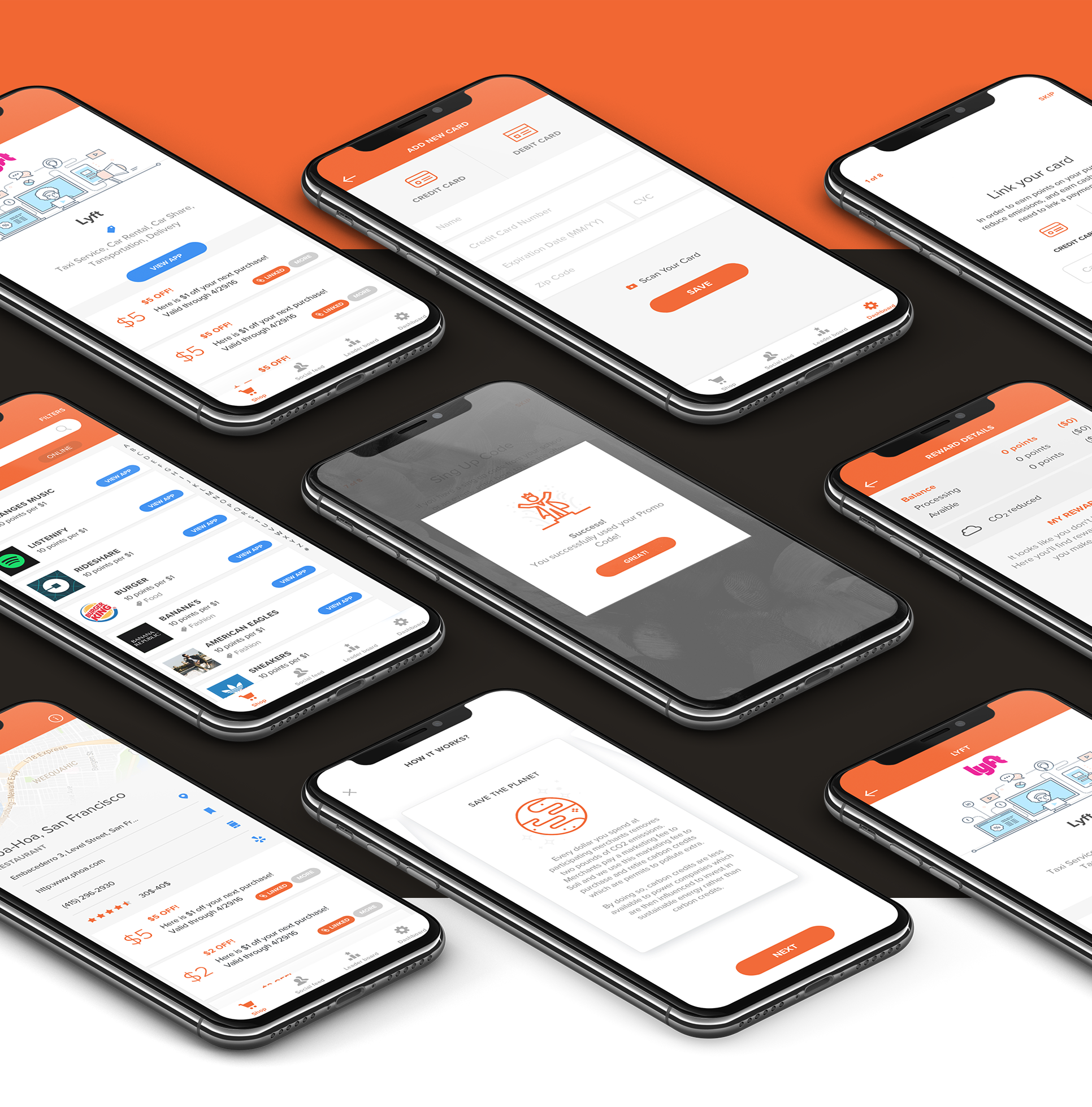
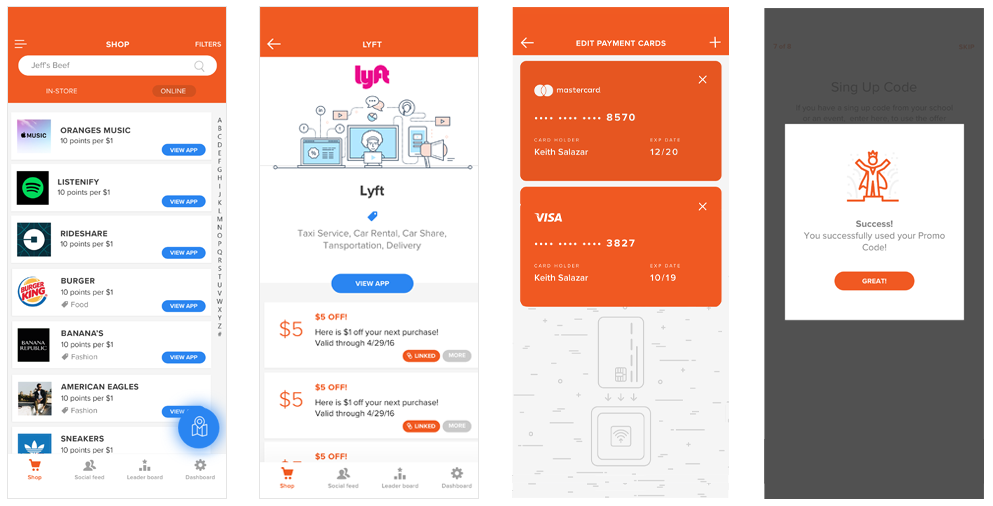
Application after iterating in its 2.0 form, was in line with user needs, making it easier to perform crucial features - finding shops participating in Soli program and getting money for using the app.
At every part of the process, we made sure, that current users are able to let us know about their experience and thoughts.
At every part of the process, we made sure, that current users are able to let us know about their experience and thoughts.
